


![#thedailymoments || Week 4 [in honor of my dearest Debi]](https://images.squarespace-cdn.com/content/v1/55035a45e4b0bf46165be20d/1533277489778-672U8T4ZI5X0HEVLZTID/IMG_8387.jpg)


10.31.19 We had the transfer Oct 31st and we had to wait 12 days until we took the blood test. I couldn’t wait and took a couple at home pregnancy tests on the 6th day and they were positive!
11.11.19 We took a blood test to confirm at the doctors office and schedule our first ultrasound.
11.21.19 The day we met our baby. We were 5 weeks and 4 days so we weren’t supposed to see any sort of heartbeat, but when we went in the doctor said, yes. That’s a heartbeat. We couldn’t believe it because the last time we had an ultrasound with a baby in my belly, we heard the words, “I’m sorry, there is no heartbeat.” And we’re terrified to hear it again. Elated and overjoyed, we saw your heartbeat and it all felt so real. We’re actually having our rainbow baby at the end of this journey.
11.27.19 And then on Thanksgiving Eve, 7 days later we had another check-in where we were told there had been no progress and they couldn’t see a heartbeat anymore. She spoke clearly and said, “I’m sorry, I’ve looked as hard as I can. We can check back in 4 days but from what I am seeing, most likely this pregnancy will not continue.”
We left the office heartbroken and in disbelief. We spent the holiday holding onto any sliver of hope but also trying to lean into the grieving period and acceptance that we have lost another child and this process did not work for our family.
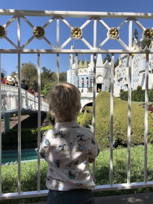
11.28.19 as we ate our Thanksgiving dinner just the three of us, “Is the baby out yet?” Finn asked. “The baby may have to go to heaven,” I said to Finn and he replied, “Well, when can we visit heaven then mommy?” They’re really are no words to describe the hurt and sadness those four days held. We sat in silence most of the hours, we tried to show up for holiday dinners with friends but the pain was hard to hide. Each time I went to the bathroom, I sobbed in fear that today was going to be my last day with my baby. But it never happened, no spotting, no cramps, I still had morning sickness and I was still eating like I had a small miracle inside me.
12.1.19 Sunday came and we knew what we were going to see at our appt; we were going to hear those words again. The ones that would most likely end our journey and solidify the fact that we will always be a family of three. My whole body was heavy but I was trying to be strong for Finn and my husband. It was so early we were the only ones in the office. Two nurses behind the desk and one doctor. We entered the room and the doctor excitedly asked (she must not have looked at my chart yet) “Good morning! How are you?” I looked at her and simply said — I’m hoping you can give me a miracle today.
As she washed her hands and prepared the ultrasound wand Jason started asking all the questions. “Why would something like this happen? Why did we not see a heartbeat? What could of caused this?” She calmly explained, well, you’ve done the genetic testing so the embryo is viable so I’m not sure, but it could be a number of things. The fetus didn’t get enough blood, the hormone/thyroid levels could have been off (which hers seemed to be normal) so ....” she continued and I closed my eyes and it all started to sound like the teacher from the peanuts (wahhhhahahhahahahahahah) as much as I wanted someone to tell me why, I just wanted it over.
I wasn’t looking at the screen, I didn’t want it to end, I was still clinging to any hope that this could still work, that I would see a heartbeat. Just as the doctor inserted the camera, she gasped, “oh my god! I’m giving you a miracle right now! I don’t normally say oh my god but, this is worthy.” I’ll never forget this moment. I sobbed so loudly and the tears were so big I couldn’t barley breath or see the ultrasound monitor. She said, “Heidi. I need you to look up and see this. You have a healthy baby. Perfect in all ways, the size, the shape, the heartbeat is all where it should be.” Finn started asking me why I was so sad, and everyone at this point was crying. I told the doctor I wanted to hug her, she’s pretty stern (in the nicest way possible) and I love stern because that’s my husbands' demeanor too. She said, “you can hug me after you get dressed and come out.” When I came out, she said, "how about that hug now," and we all cried together. Even the two nurses were crying and both said they couldn’t believe it either. She went back into doctor mode, and gave us the plan, "I want to check your hormone levels still but from what I can see everything is going great! You should make a regular OBGY first prenatal visit appt, etc". This was quite the change from the last doctor who told us our pregnancy was ending. I begged her to take some blood tests and she told me, “I’m sorry and this point those don’t really matter. I don’t even see a faint line of a heartbeat here.” She was certain and made us feel convinced we were no longer pregnant. Now I want to just say, I don't think she did anything wrong. I've seen enough ultrasounds of my uterus at this point to know what I was seeing on that day. I saw it with her, I moved my body so the wand could move and we tried for 5+ minutes to find that heartbeat, we didn't see it.
I’m 8 weeks today. I’m still in complete disbelief this happened. Our miracle rainbow baby is coming in July. I choose to believe this with all my soul. And I can’t wait to meet him/her.
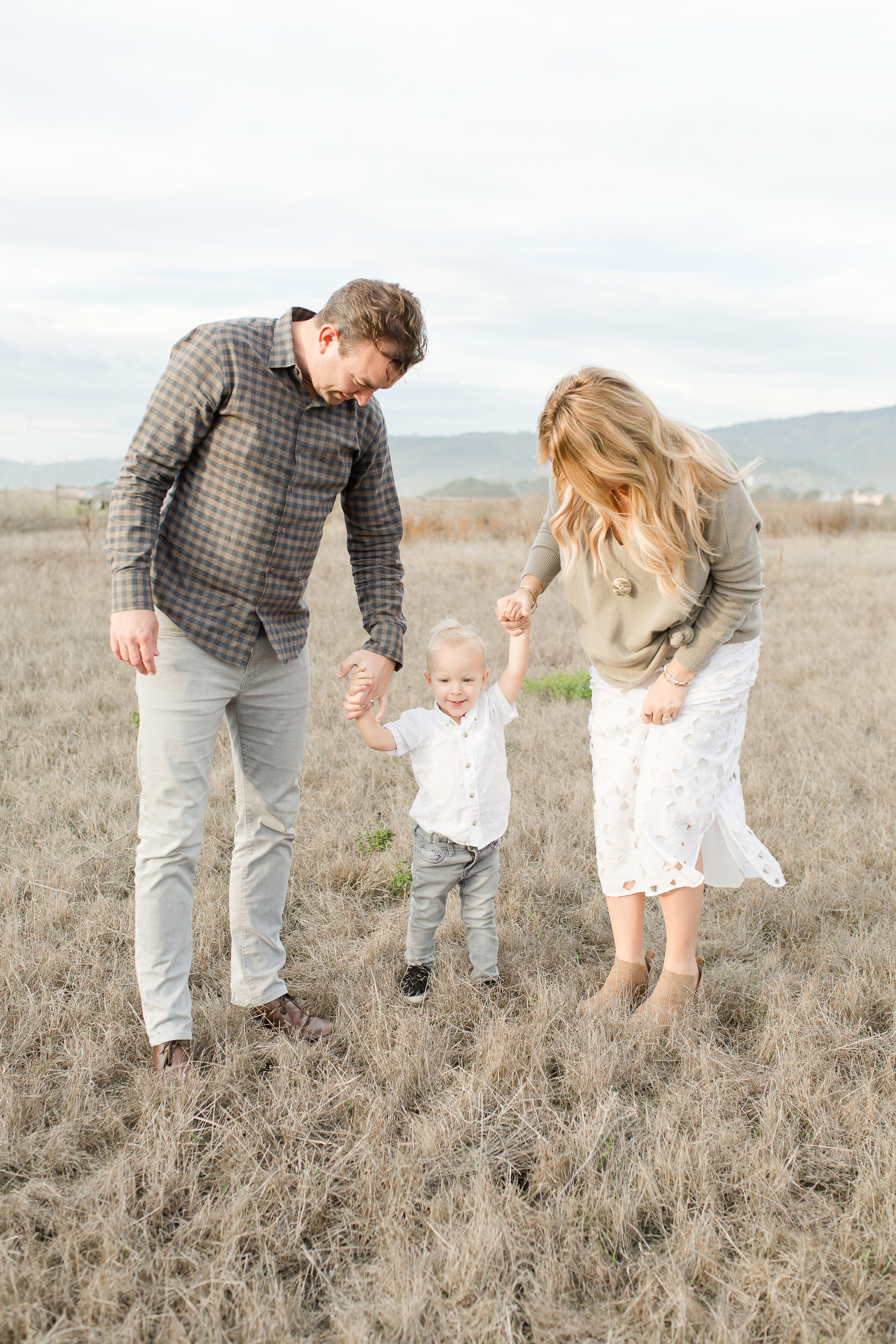
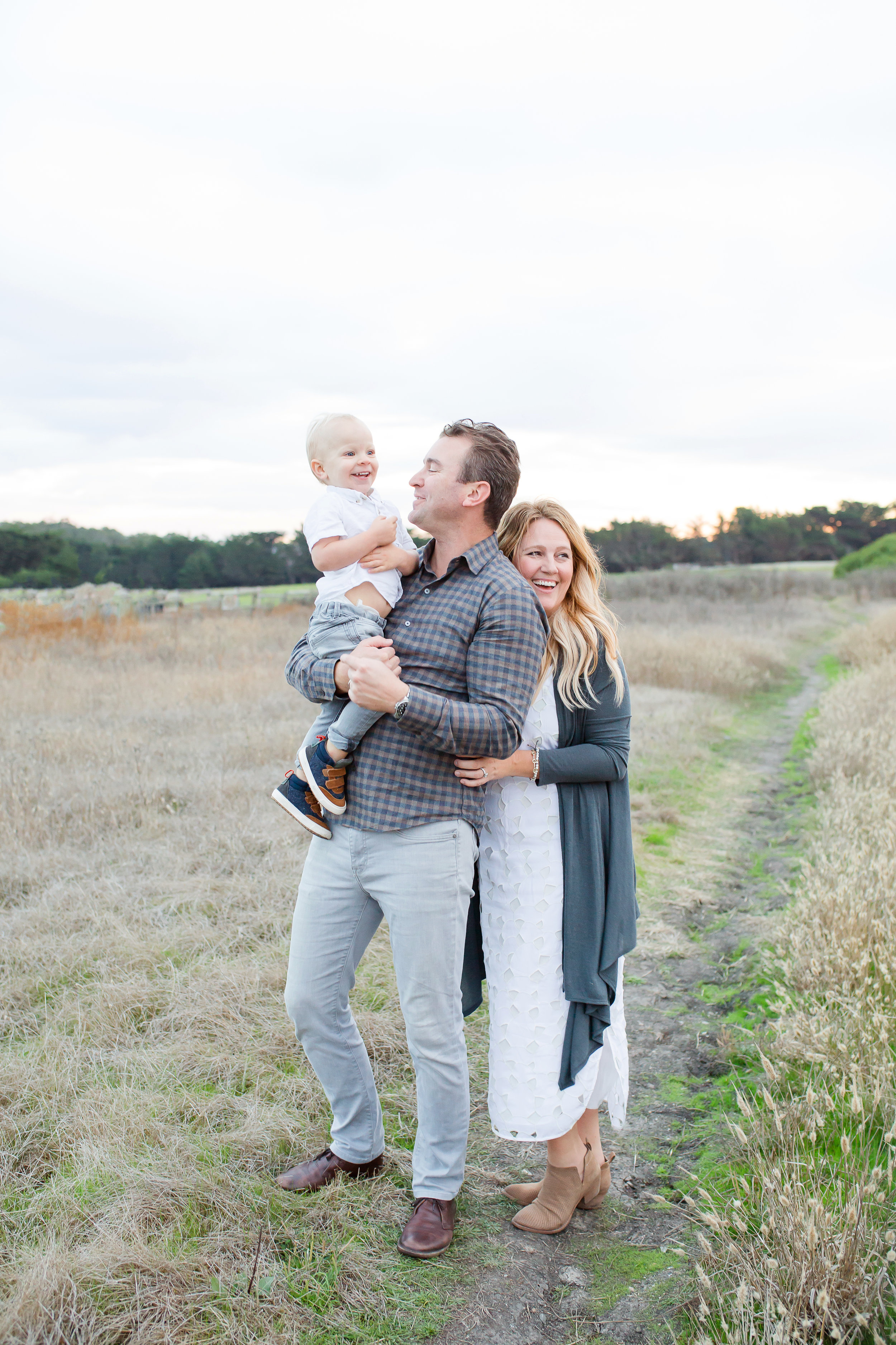
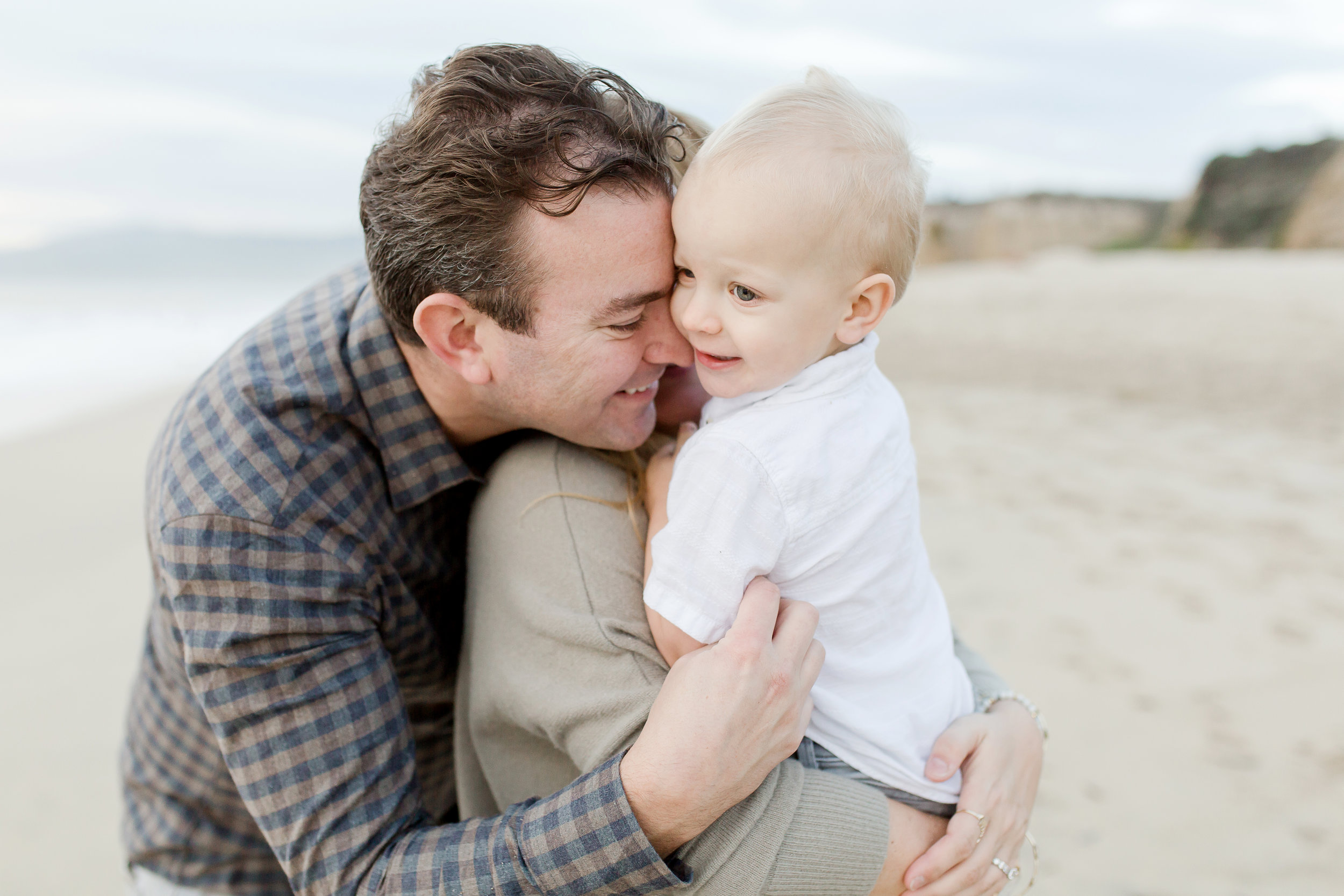
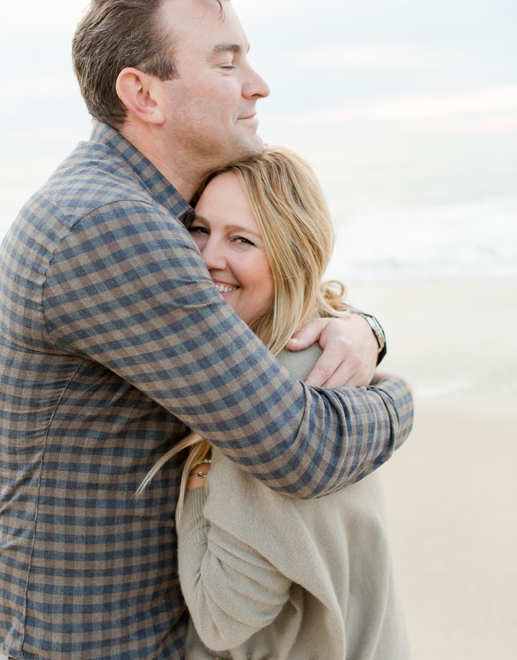
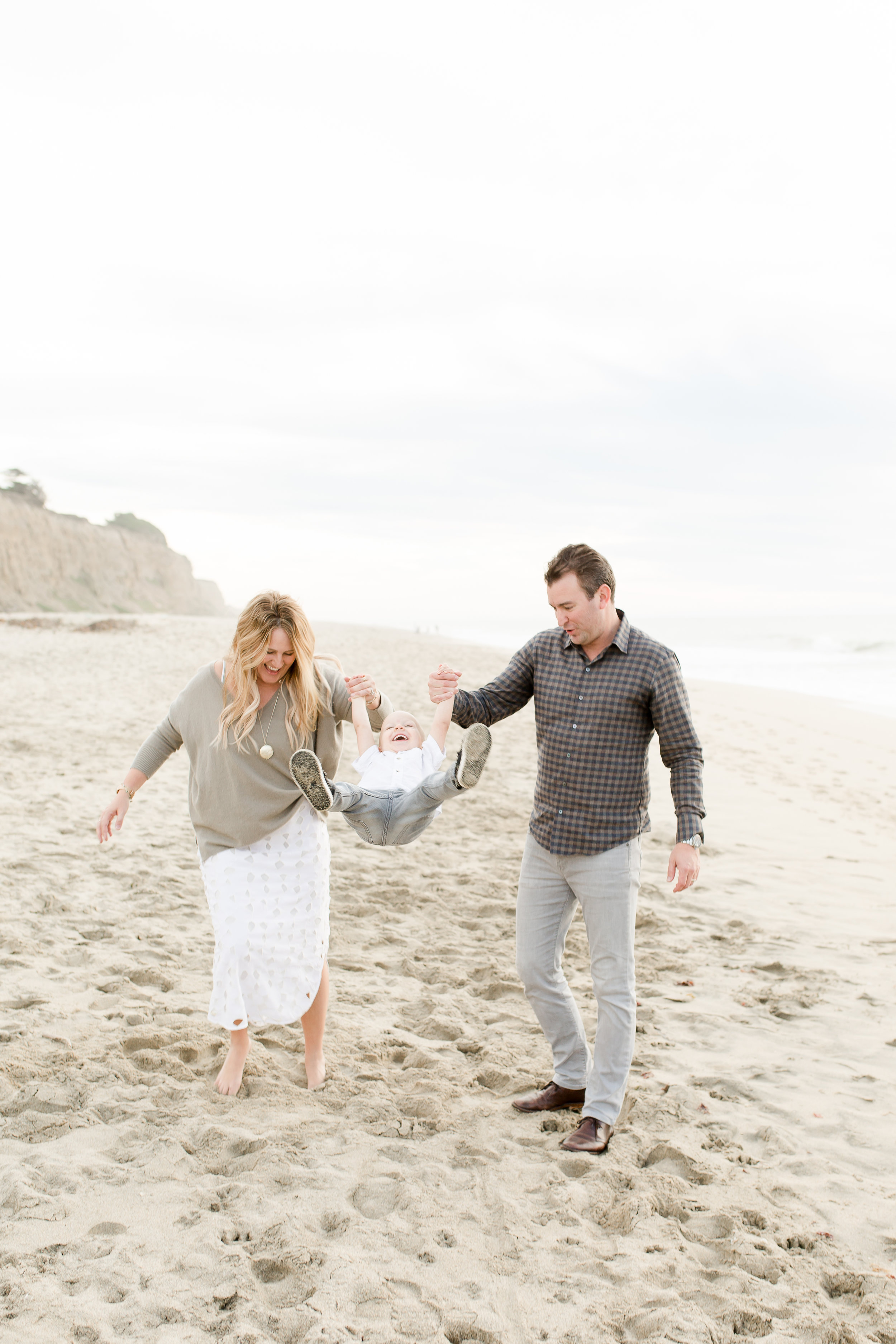
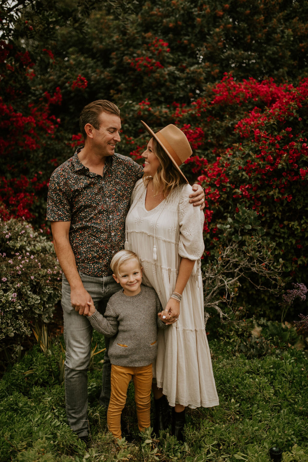
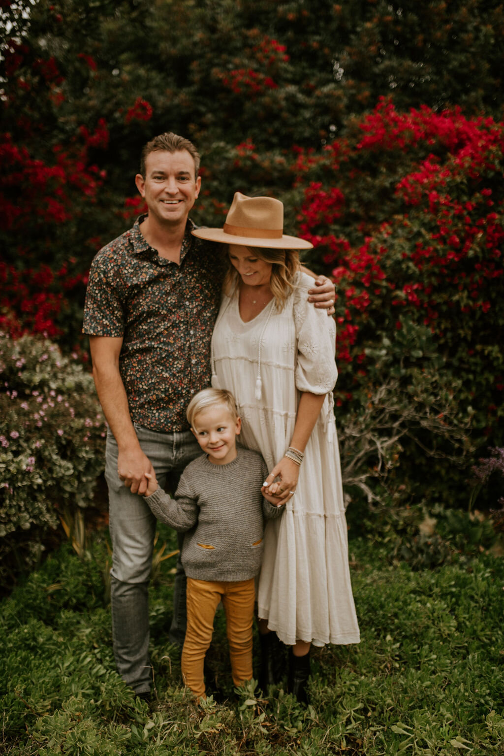
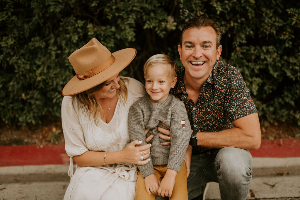
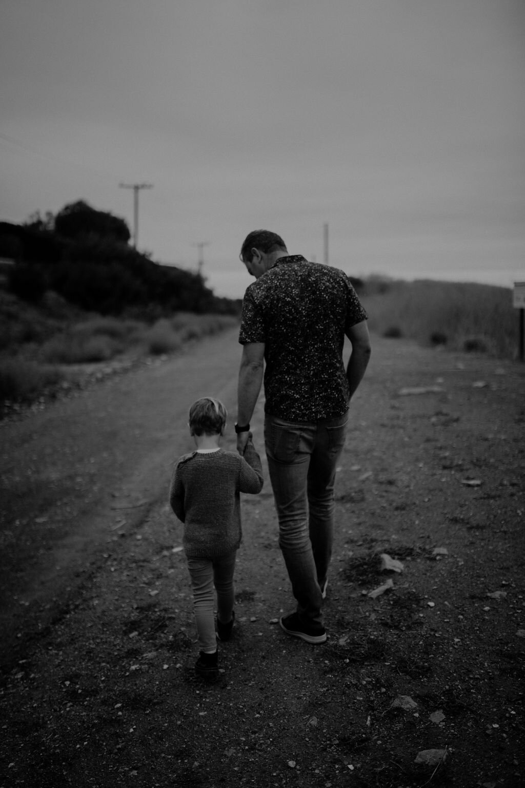
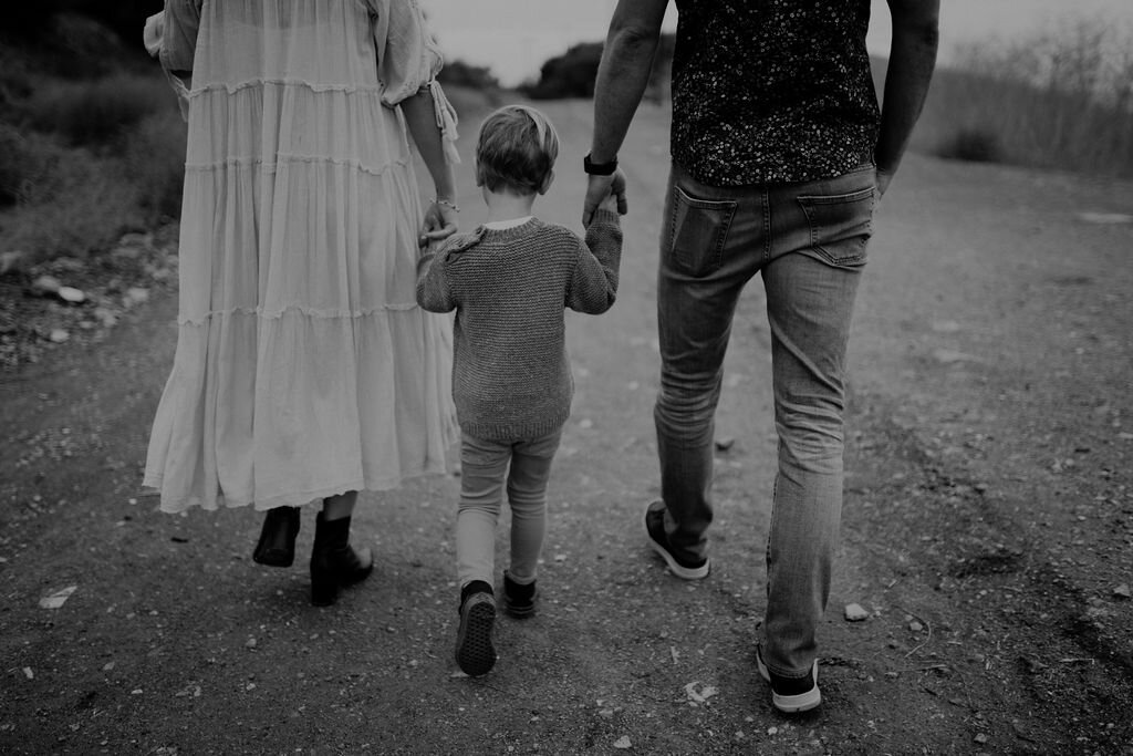
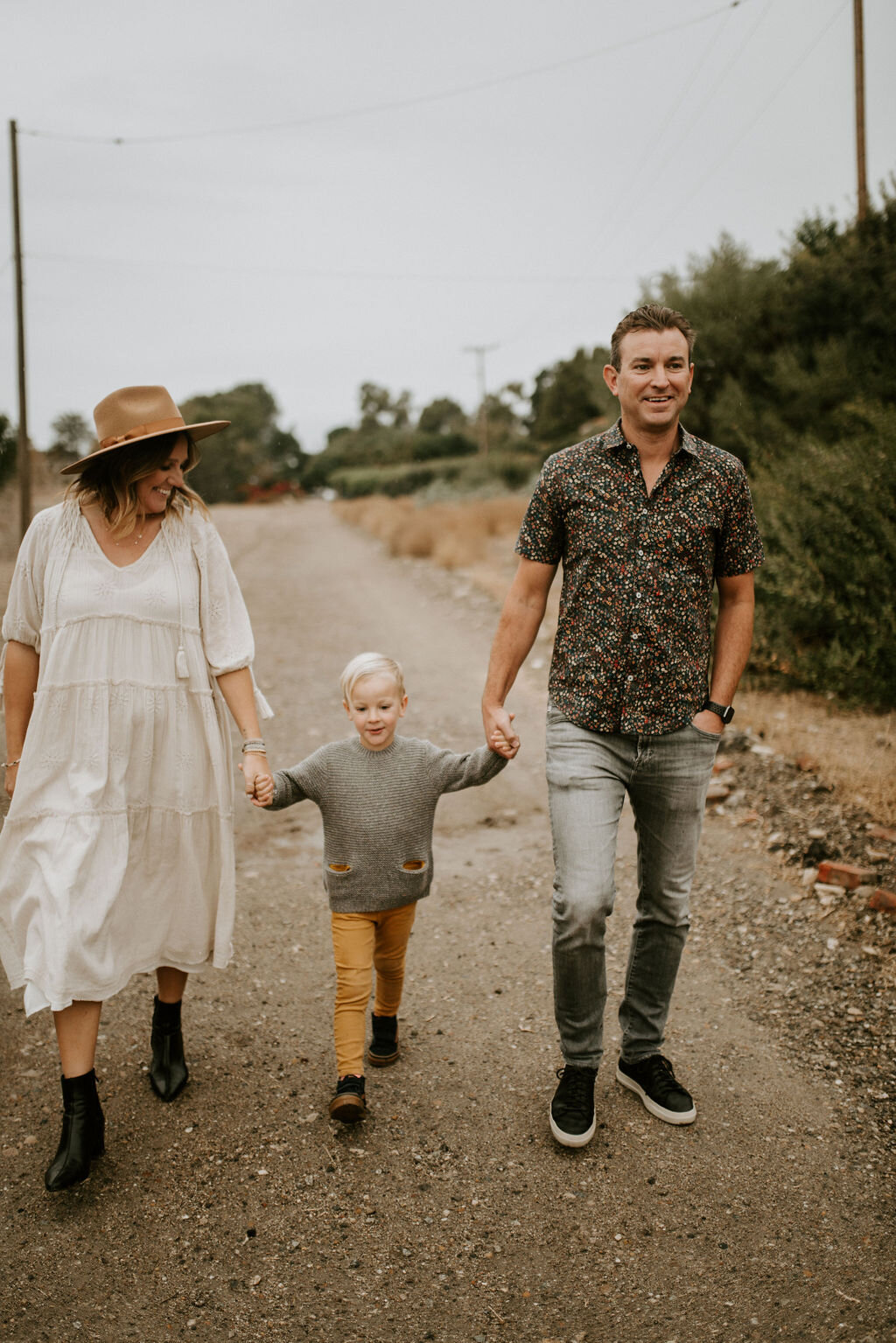
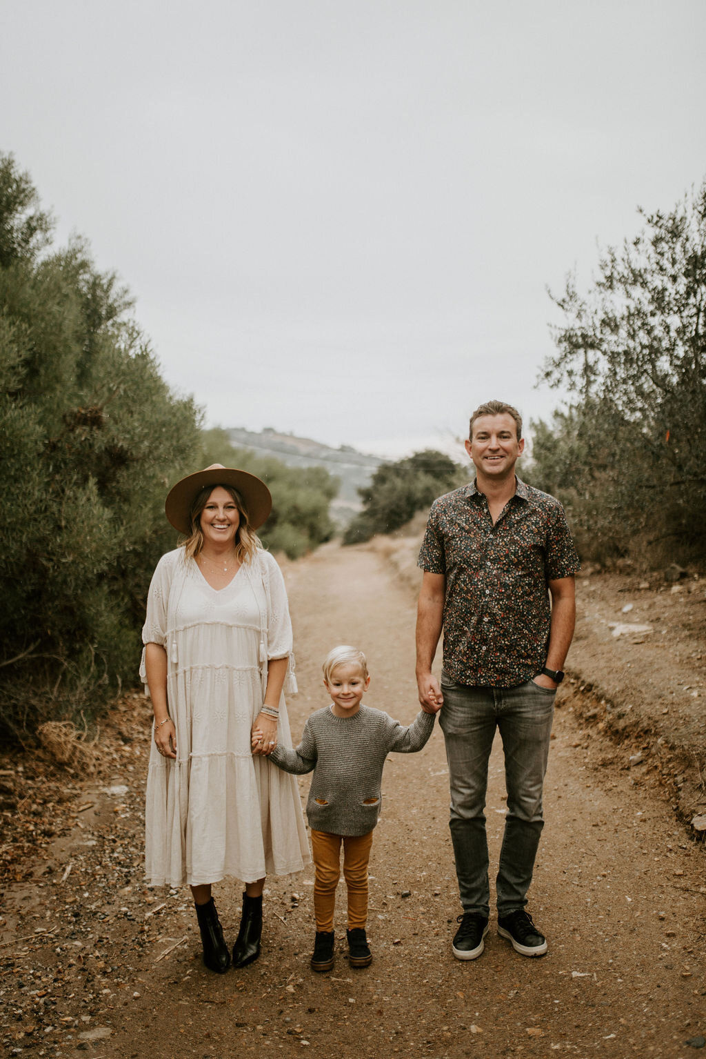
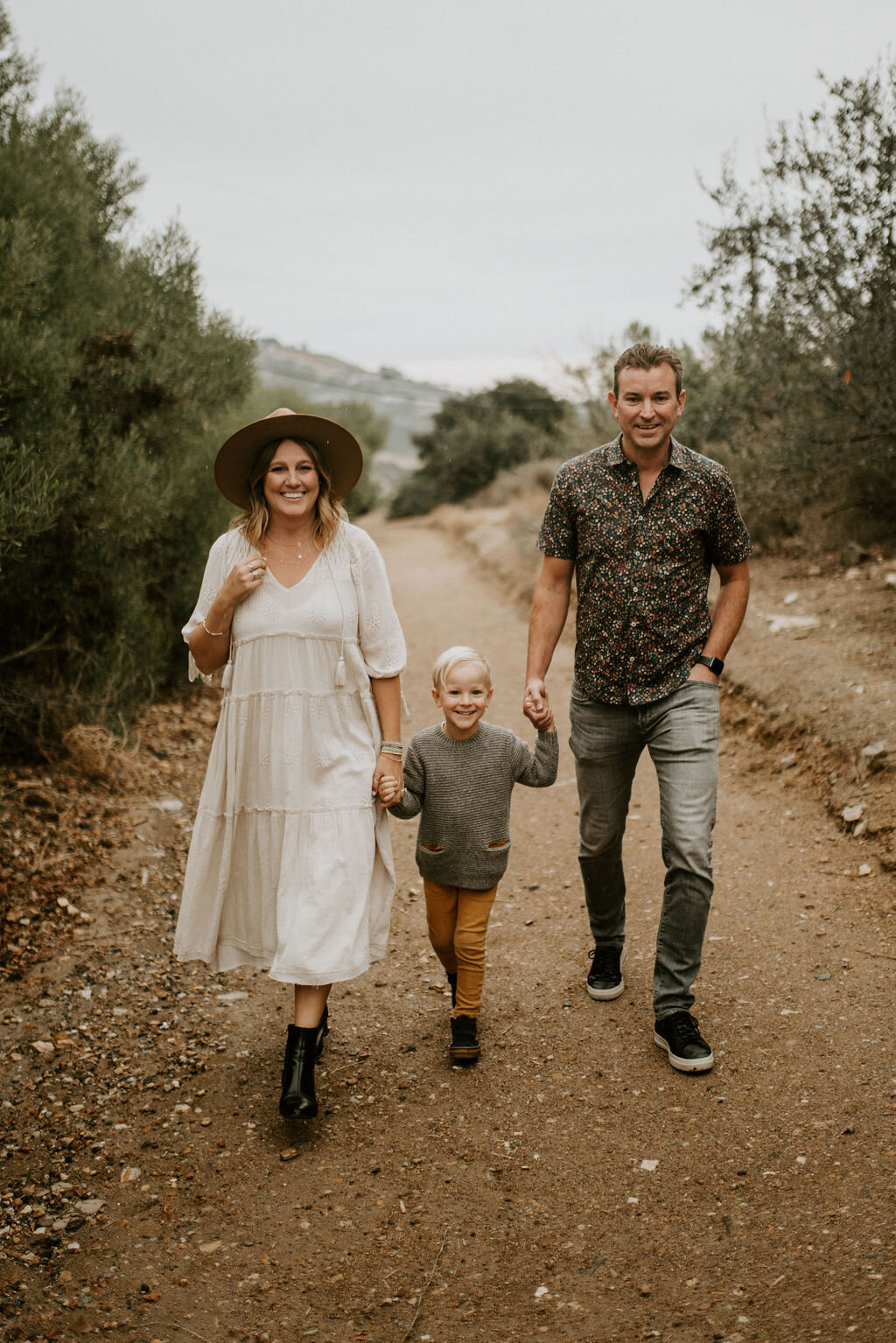
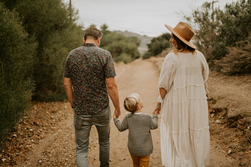
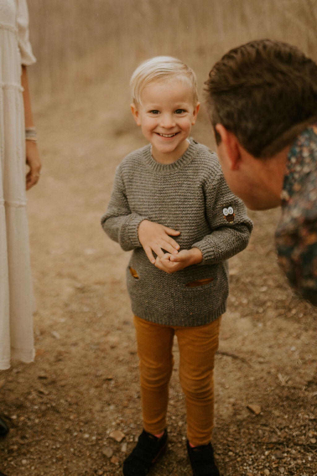
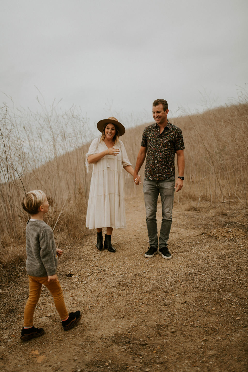
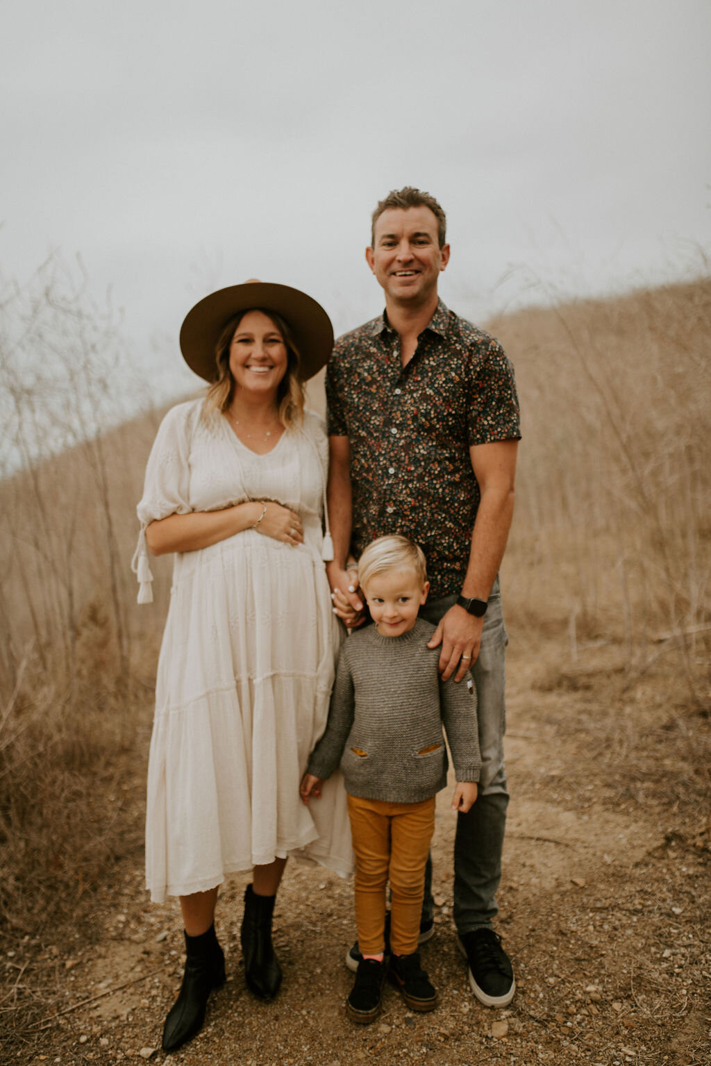
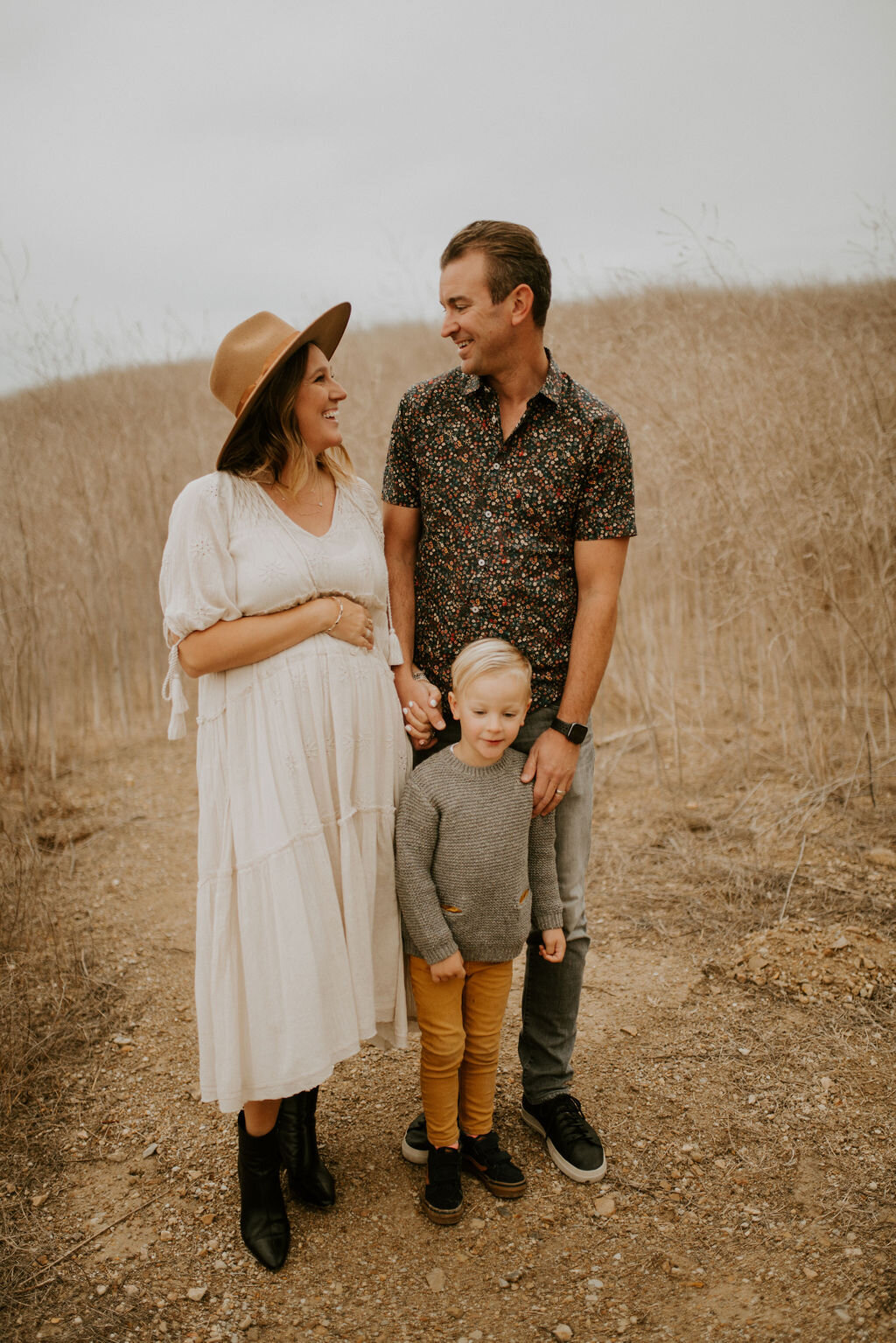
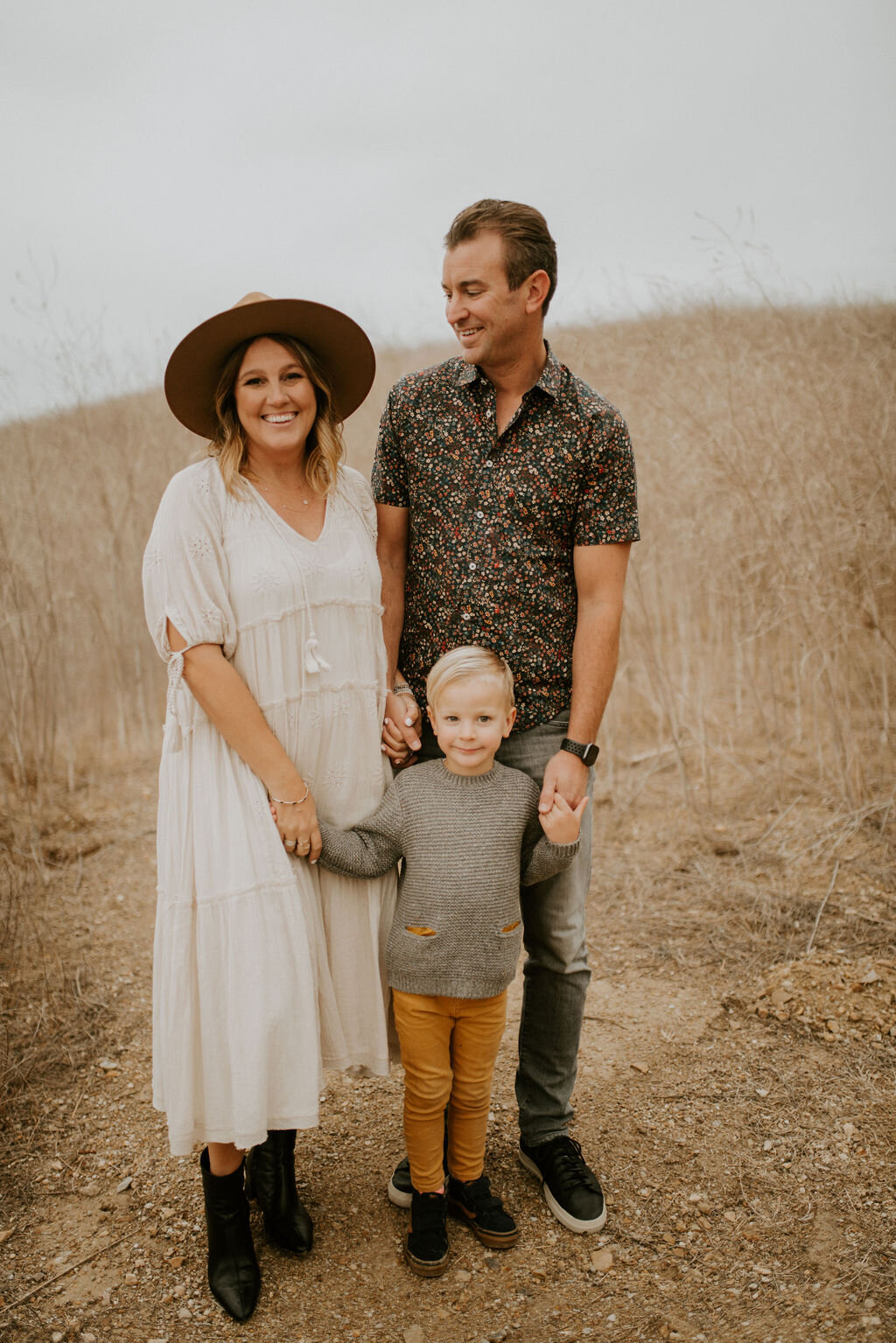
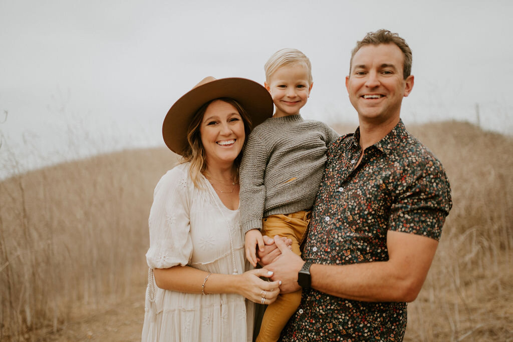
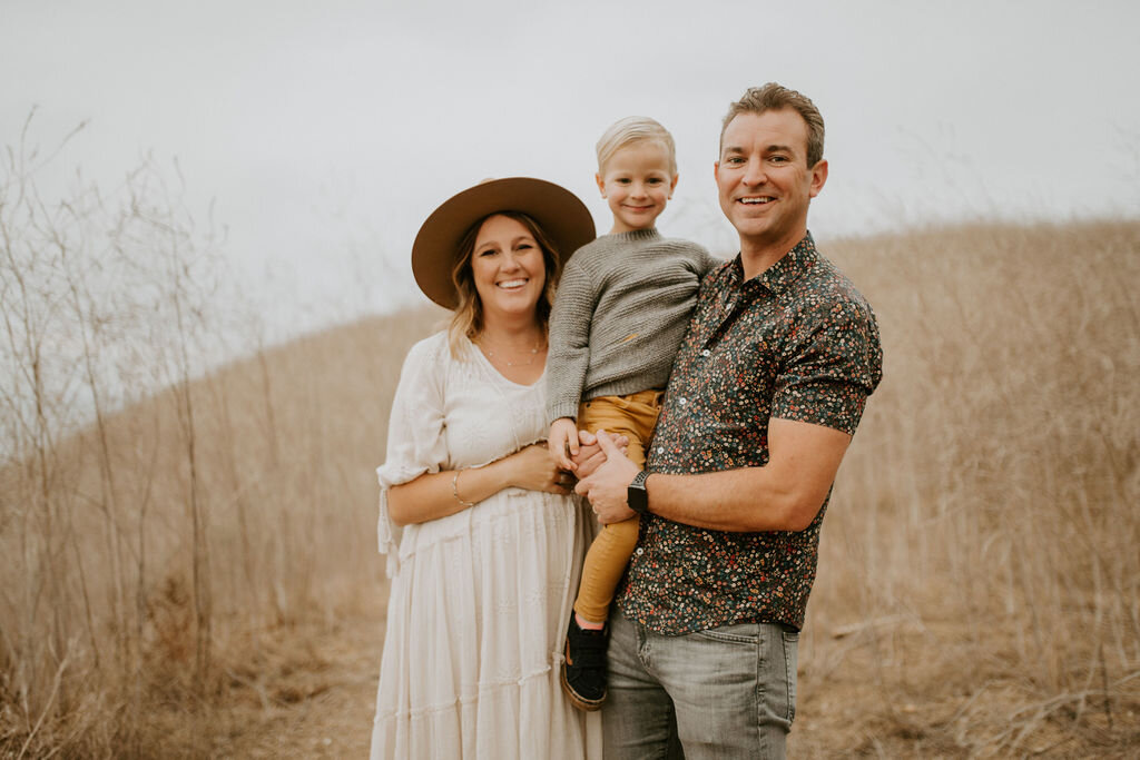
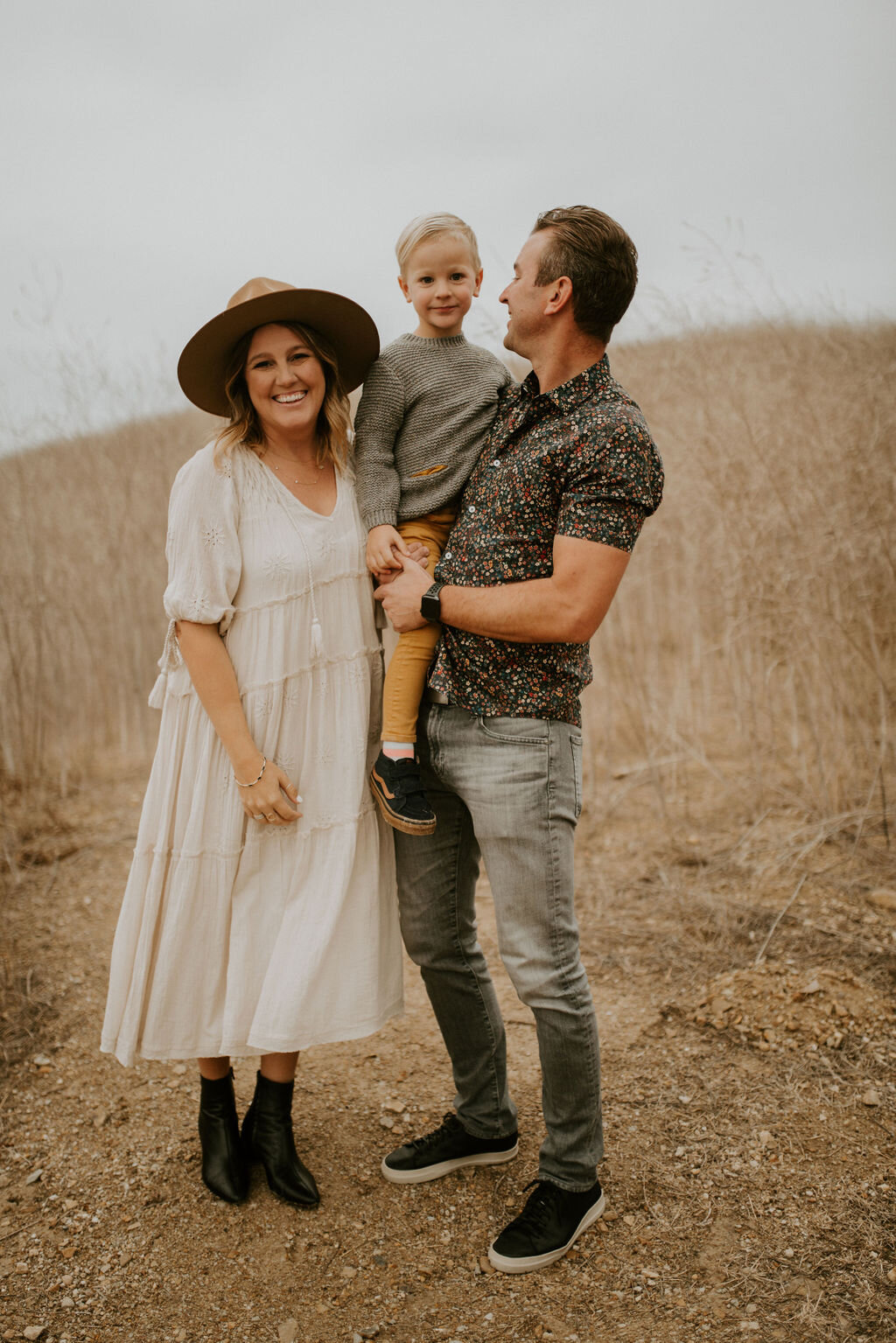
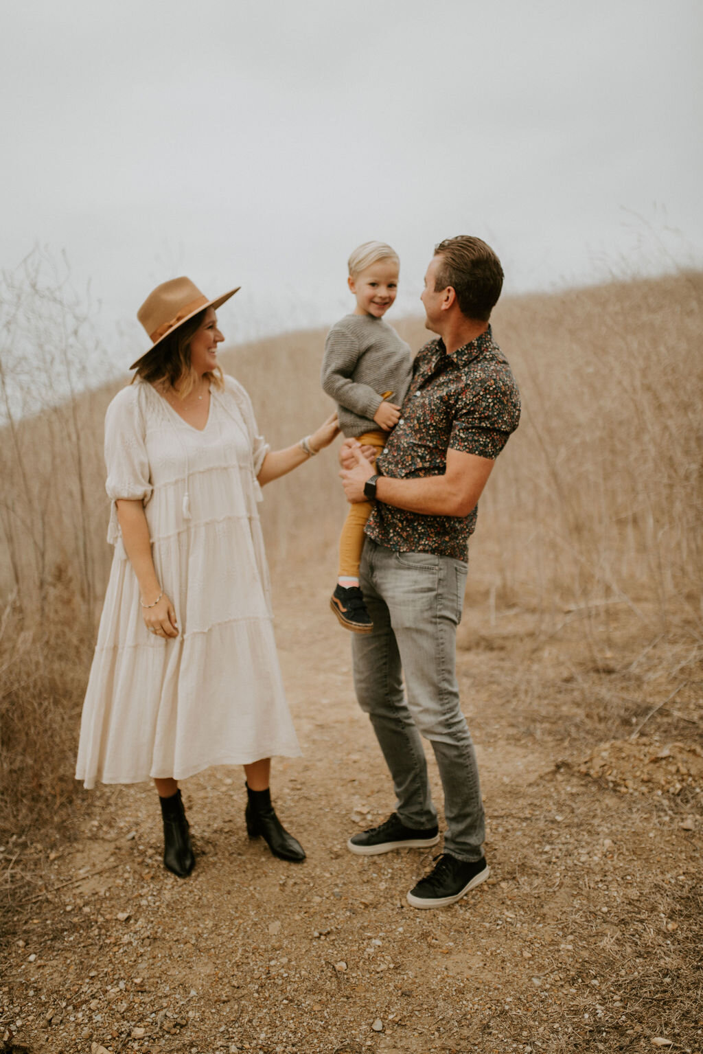
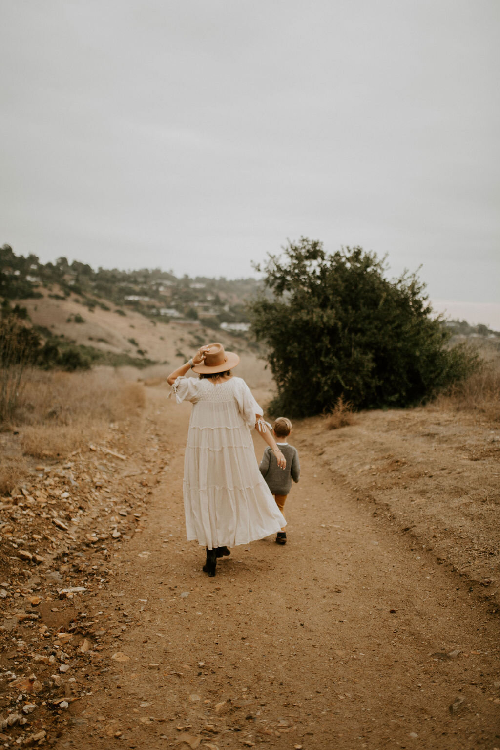
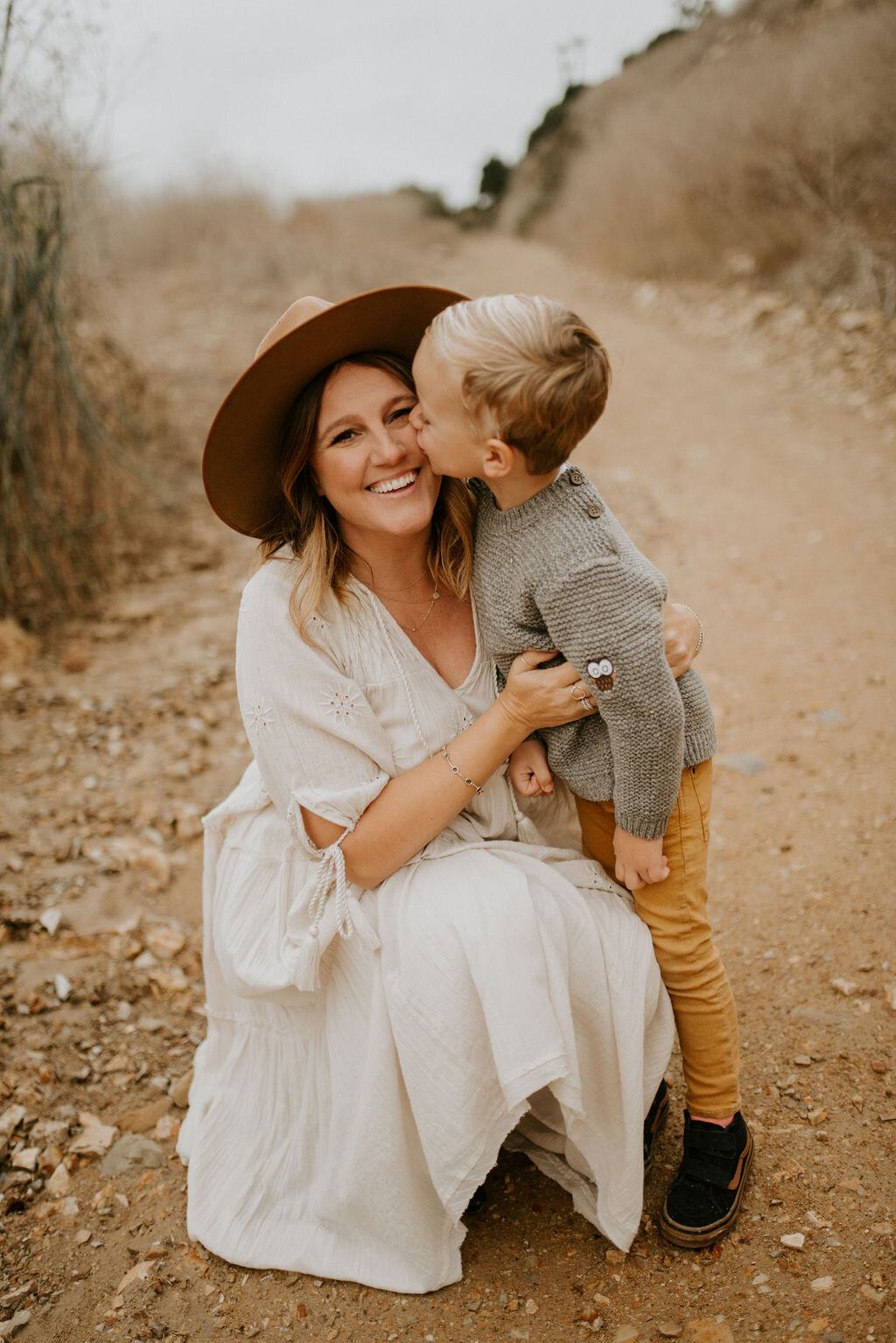
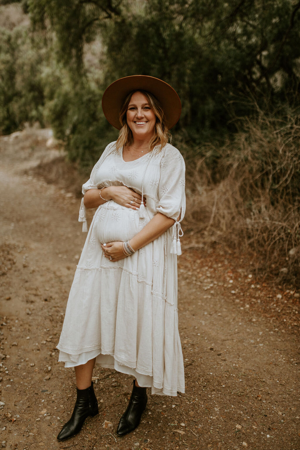
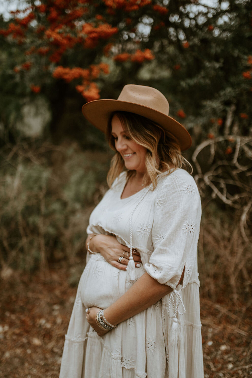
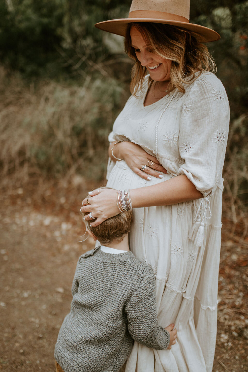
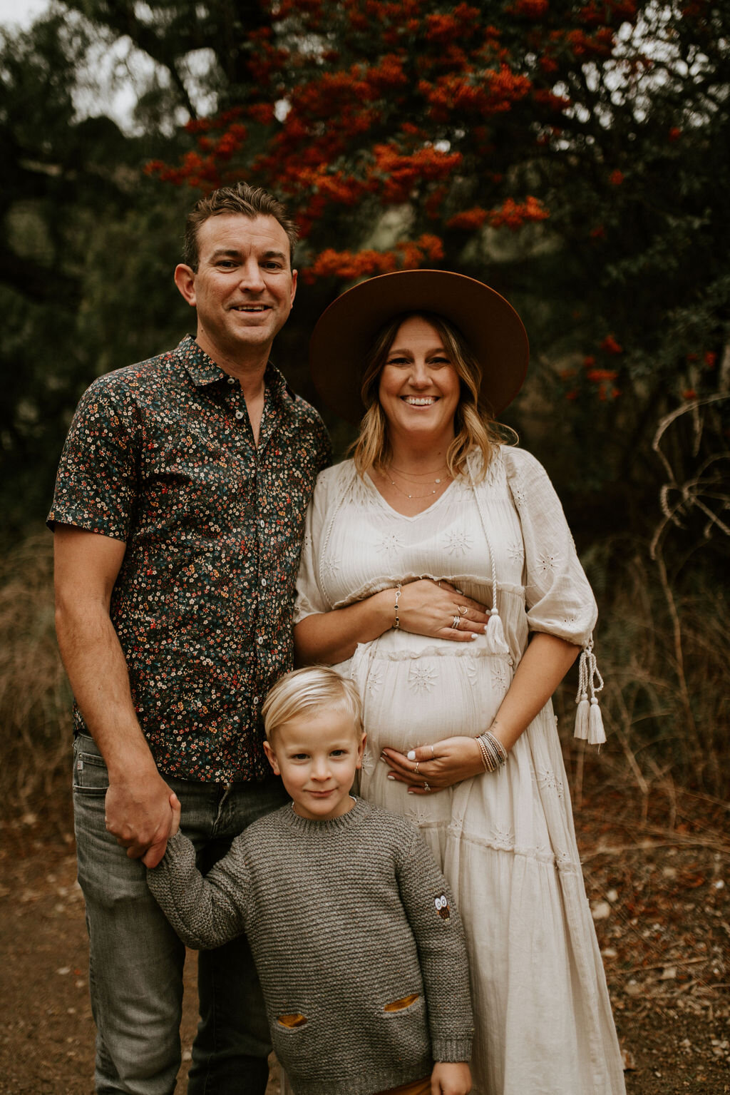
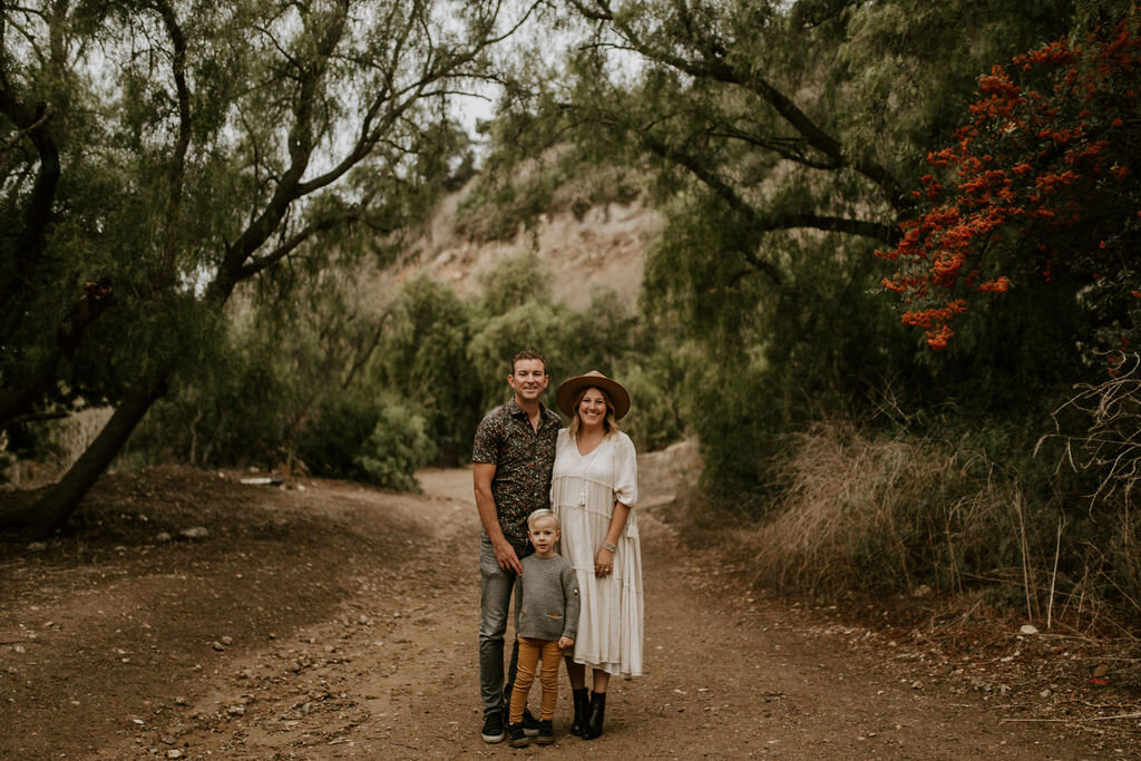
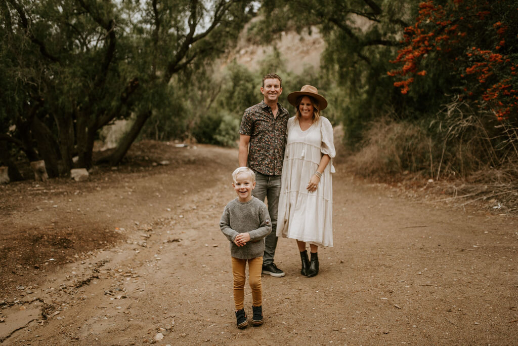
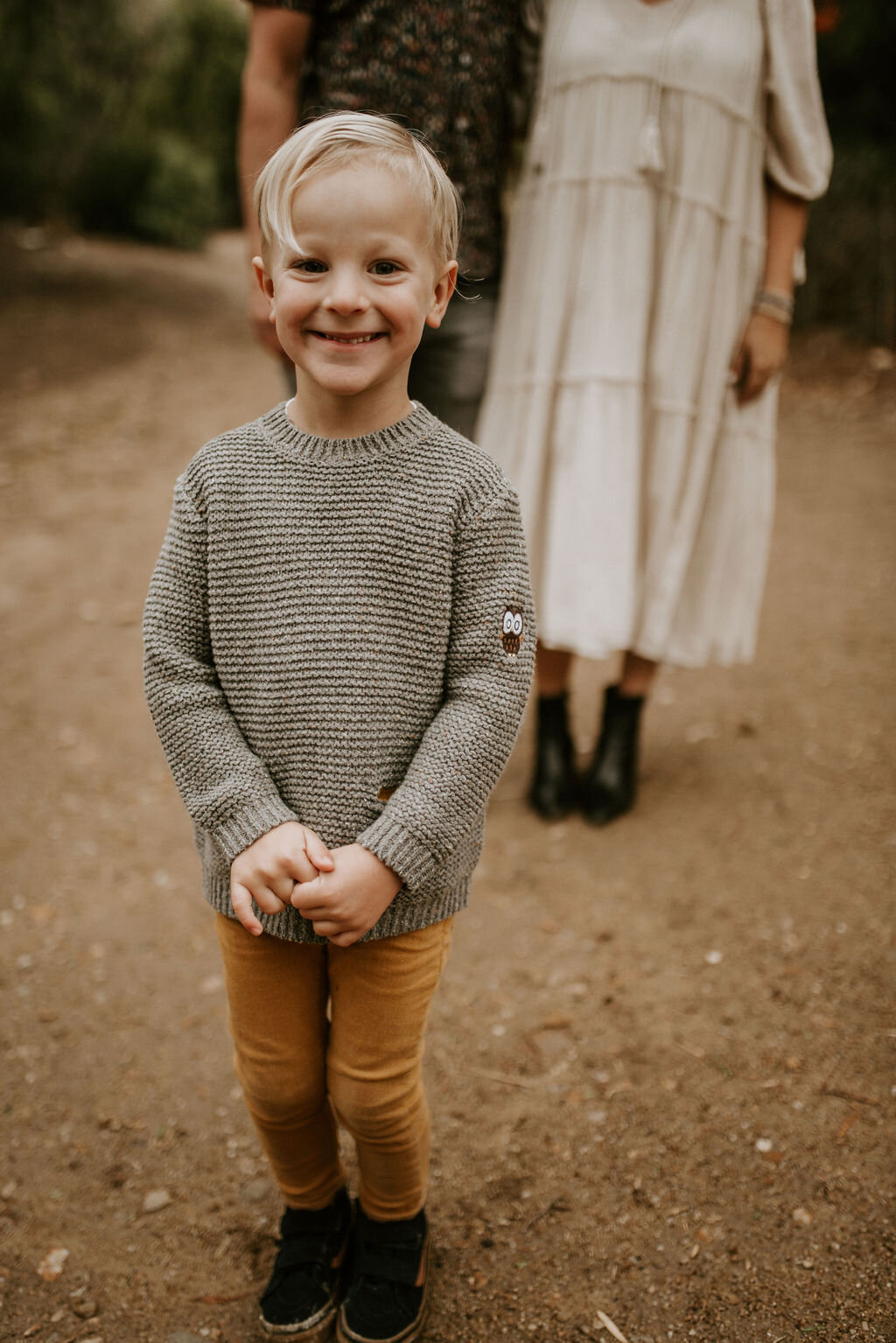
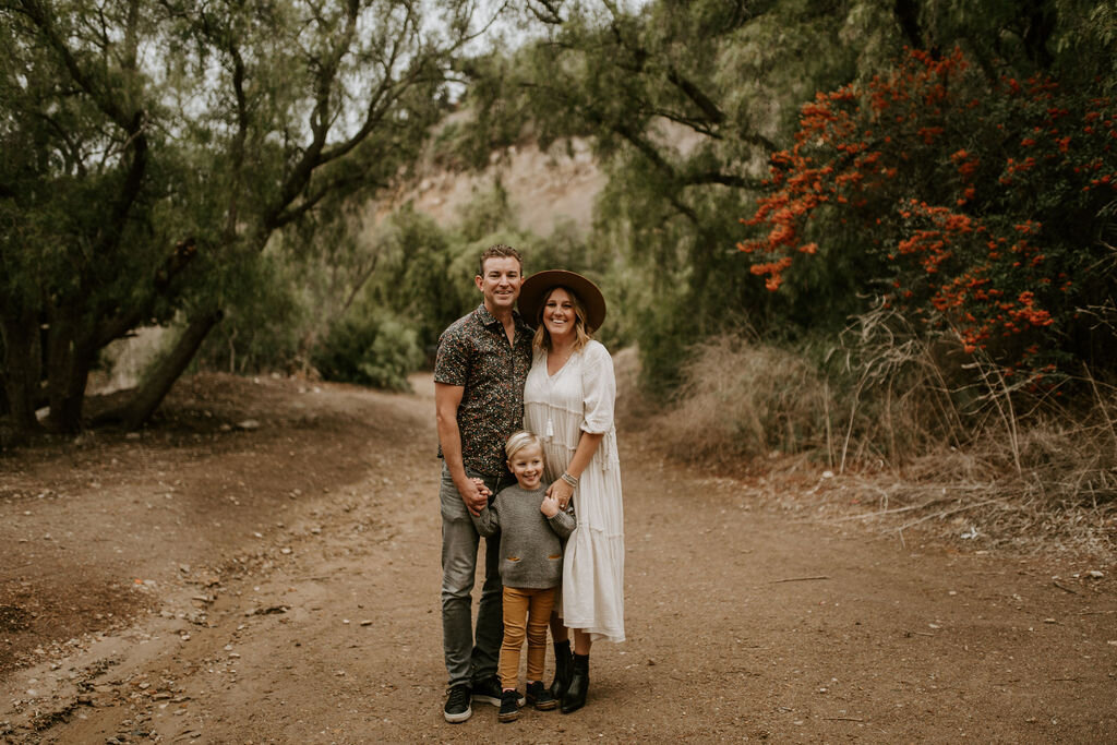
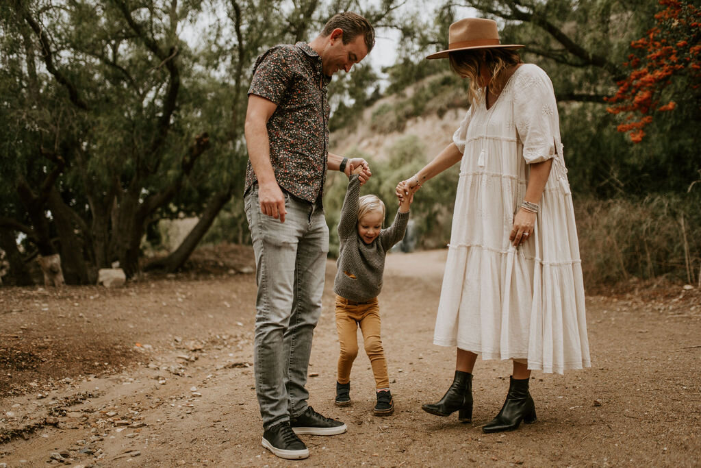
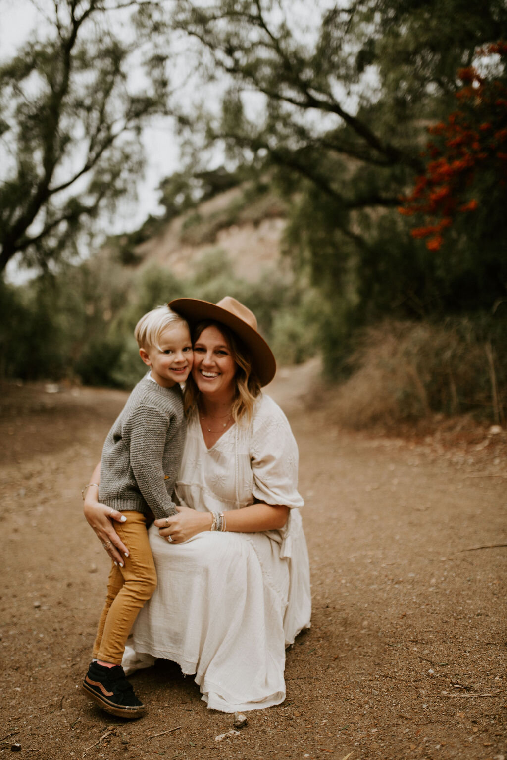
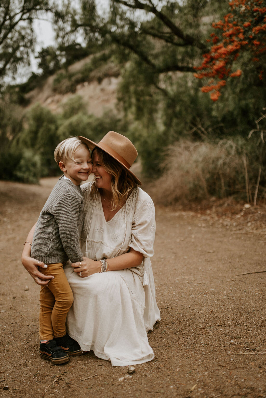
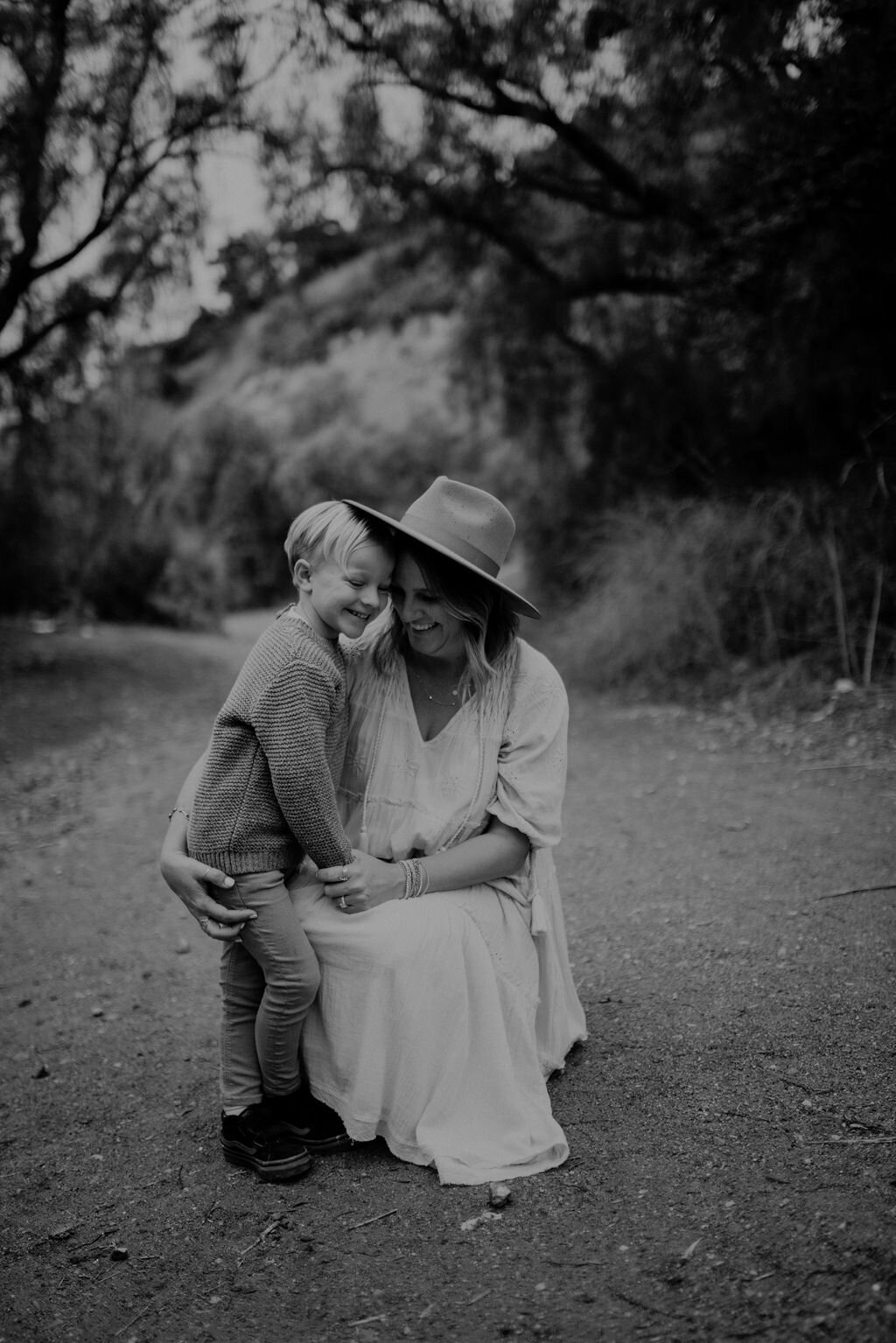
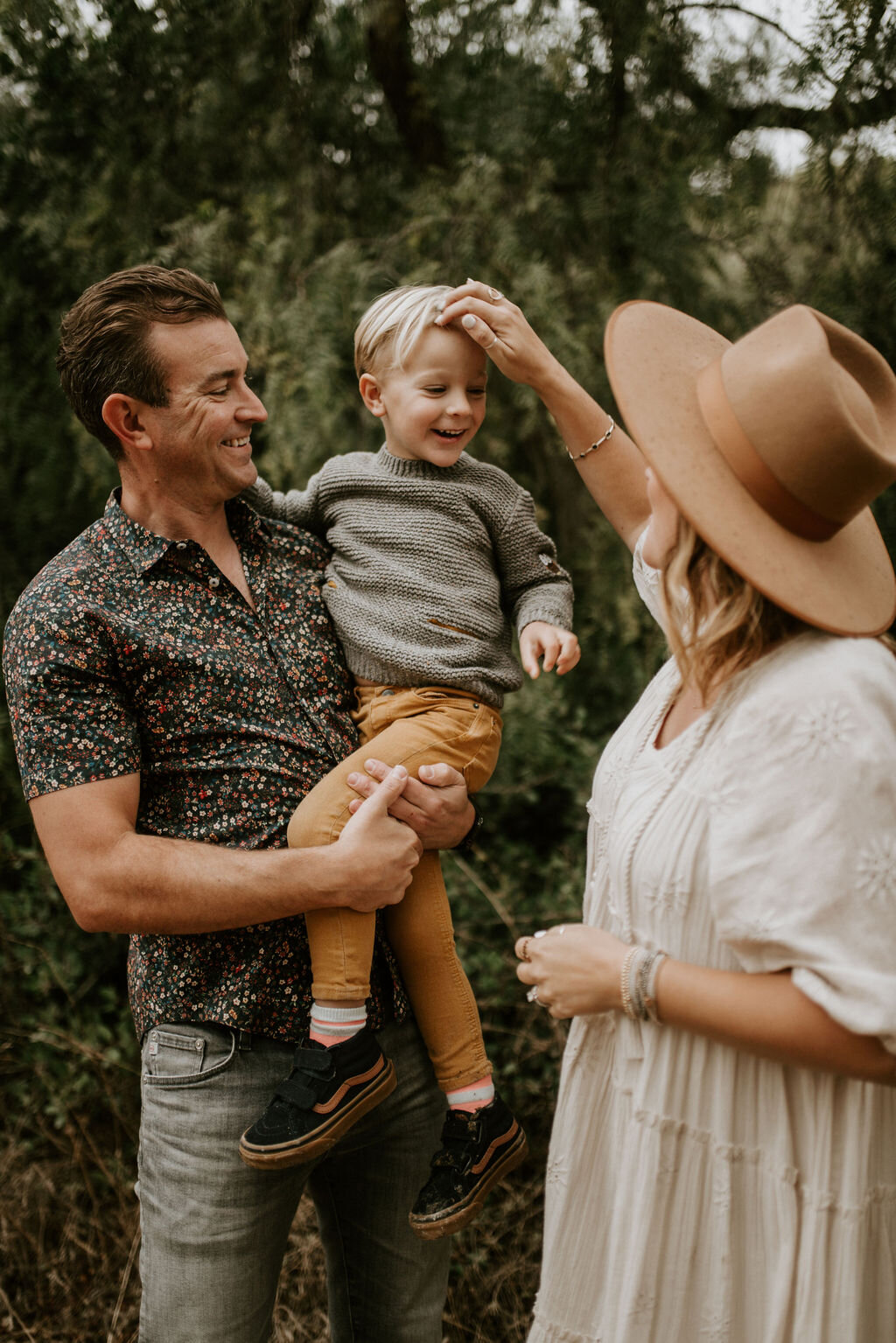
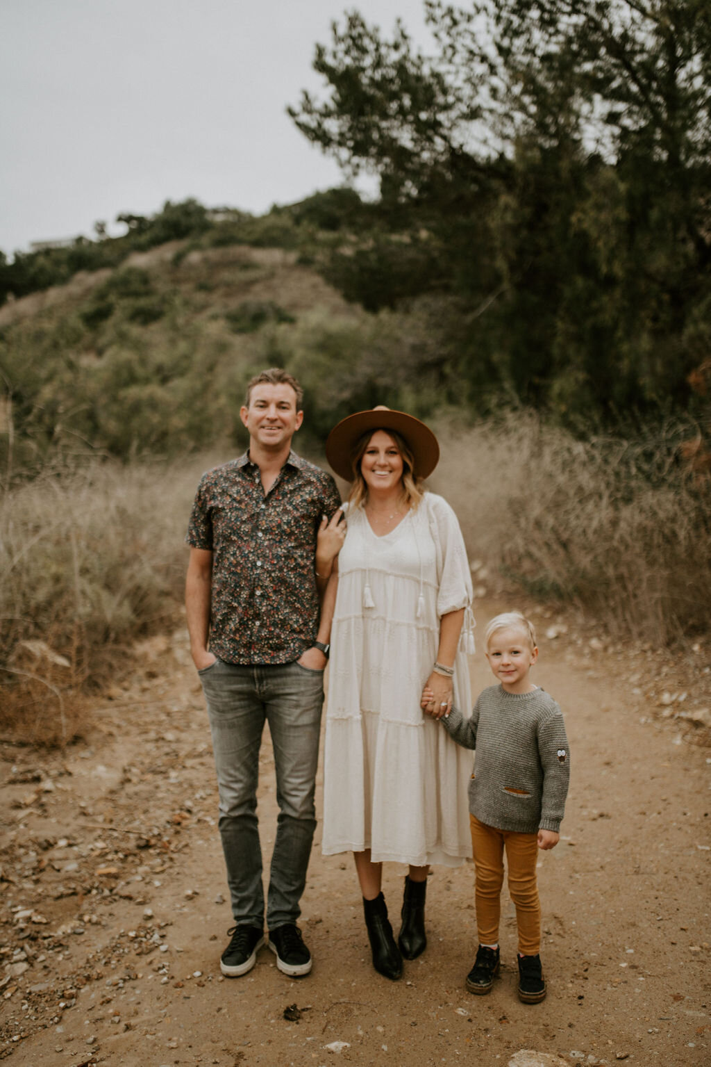
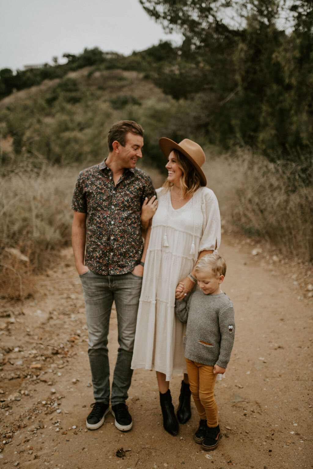
We took all these photos the Saturday before we found out about the miracle. We sat with this news for 4 days and at this point, we had lost much of our hope and were being realistic about what was happening. Jason appeased me and took some photos with my "bloated bump" and pictures of the ultrasound from the week we first met our rainbow baby and saw that heartbeat. I knew this pictures would most likely be the way I told you all about our news, but tried to manifest our destiny, and told Jason, "These will be our announcement photos when we see that heartbeat tomorrow!" We both wanted to believe it. We really did, but we wouldn't know until the next morning. Thankful for Jade, who had no idea that's what was even happening. She captured us so beautifully even in this time of sorrow and hurt.


![EDIT LIGHT - UP EXPOSURE +TAKE DOWN SHADOWS [IF NEEDED]](https://images.squarespace-cdn.com/content/v1/55035a45e4b0bf46165be20d/1537982720932-HFJM0QN69M2XCLP9GLRK/MANDI+NELSON+PRESET+EDITING.jpg)
![COLOR TAB - MIX [TOP RIGHT CORNER] ADJUST ORANGES [SKINTONES]](https://images.squarespace-cdn.com/content/v1/55035a45e4b0bf46165be20d/1537982766501-Y0H0217X6UD76VUBJV30/IMG_5132.jpg)